Tonight I looked over the .pdf for lesson 3. After I shot the photos, I got on 2peas to see where the rest of the ongoing class were in their lessons. I started this on my own because the group on the website was several weeks ahead of me. I was thrilled to find that some of them were also a few weeks behind. So if I can get in 2 lessons each of the next 2 weeks, I will be caught up with the class! Here is a link to that class thread for week 3 in case you want to see: http://www.twopeasinabucket.com/mb.asp?cmd=display&forum_id=21&thread_id=3035904
Now, about the actual lesson. Most cameras have a setting called WB, or white balance. I have always just shot on AWB, or auto white balance, in the past. Well, low and behold, there are multiple different setting for the different types of light and a custom setting so that you can adjust it yourself for your conditions. This is a huge development for me (no pun intended). Now I know what to change on my camera to get rid of certain color casts and that yellowish glow you get when you take pictures indoors with artificial lighting.
This concept is best illustrated with a white or colorful subject. I'm working on this in my bedroom while everyone else in the house is sleeping, so my subject is a bundle of cheap pearl bracelets and a fleece blanket. And without further ado, here are my photos:
All shot ISO 1600, 1/50 sec, f/5.6
Tuesday, November 16, 2010
Wednesday, November 10, 2010
Tattoo Shoes
A few weeks ago I came across a photo of some really cool custom designed shoes. They were designed and painted by the girl on this website: http://www.figgieshoes.com
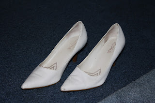
The subject matter of the designs on her shoes is usually related to weddings, and it seems her target customer is brides-to-be. I was enthralled by them and desperately coveting a pair. But, since I am already married, I really had no use for a pair with my wedding date and theme drawn on them. Then, a few weeks ago I pulled a box of shoes out of my storage unit in search of boots to wear this fall and came across this old, cheap pair of scuffed up white heels.
I had already given several pairs of heels away because I no longer have a professional job that requires me to wear them every day. Plus, living in a rural area with a lack of sidewalks and driveways, and an excess of gravel and mud, sort of limits the ability to wear nice heels on a regular basis. So, rather than let my entire collection sit in a closet and collect dust unappreciated, I gave away a few of the pairs I was least likely to wear again. Since these aren't that comfortable, and had multiple scuffs, I very nearly threw them out.
Then, it occurred to me that since they are white and serve no current purpose, I could use them to experiment with this method of sharpie shoe doodling. I began thinking of what I could draw on them, and decided that since I really like tattoos, but can't accept that kind of lifelong commitment to something that's essentially cosmetic, I could in fact, tattoo my shoes.
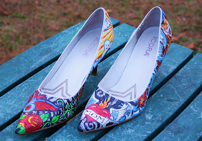
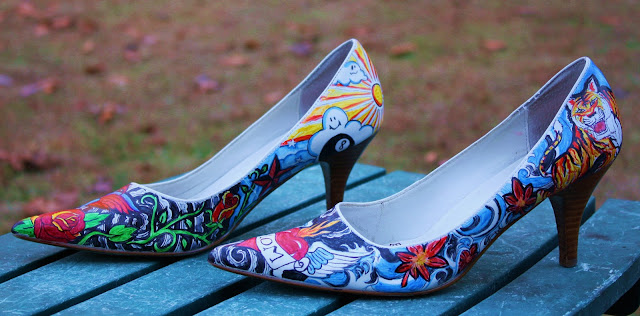
I began Googling tattoo designs and art, and the next time I went to Walmart I invested in a 6 pack of fine point permanent markers. After a few sketches in pencil, a little removal with nail polish remover and a cotton swab and what equated to a few minor cover up jobs, these were my result:
I am rather pleased with them. It was actually a really fun project. At first I just sketched on a design in pencil, and then I went over it with a super fine tip black permanent marker. After I colored the design in, the outlines would get blurred and smeared by the colored markers, so I had to go over all the outlines a second time to darken and sharpen them after the coloring in process. The entire process took about two weeks of time spent every few days in the evening while I watched TV.
I decided I wanted to keep true to the tattoo theme, so I picked designs that had some sort of personal meaning to me and then researched sleeve and full back tattoos for backgrounds to link the design as a whole together.
On the shoe in the foreground you can see a sparrow and a traditional Japanese dragon. The sparrow has personal meaning because my maternal grandfather had two of them tattooed on his chest. Another family member got a sparrow tattoo in his honor after he died. I have tossed around the idea of following suit, but again, I can't make the commitment. The dragon is a classic tattoo design and symbolizes strength, courage, and power. I think every woman feels strong and powerful in a sexy pair of shoes.
The shown side of the shoe in the background is sort of my personal homage to my husband. He has this eternal campaign of the idea that I should brand his name somewhere on my body, well this is the closest he'll every get. I gave him some nice scroll font and the key to my heart. (Aw, ain't I sweet?) The skull and barbed wire are also references to him because he has tattoos that incorporate both on his arms. Roses are also a typical romantic symbol and I made this particular one blue to be a bit more masculine.
You can see that the front of the shoe in the foreground is the sacred heart with the cliche "Mom" banner. The sacred heart is typically associated with Christianity and symbolizes the unconditional love of Christ. This is why people often pair the symbol with the name of a loved one. I am a mother, and I love my mom, so I thought this would be the perfect addition.
The background shoe in this picture shows a sun and clouds with an eight ball. The eight ball is typically associated with risk or gambling. Recently, we took a risk at relocating and had to deal with some cloudy times, but in the end the sun is rising and revealing a bright new phase in our life. The nautical, or compass star, symbolizes making my own path. I know, I'm getting really deep here. On a lighter note, I added the roses because they are one of the most popular tattoo images and look really nice with the rest of my work. My favorite rose is the two-tone yellow and red or coral colored variety, so that's what I tried to illustrate. And just so that I have complete research, the red rose symbolizes love while yellow is for joy.
I hope you like my latest project; I can't wait to wear them. I'm hoping they will hold up nicely and I'm debating whether I should spray them with some type of sealant. If they do fade or chip, I still have all the markers handy for touch ups. If you are thinking about trying something new, go for it. If you are thinking about getting a tattoo, I hope you will do at least as much research as I have before you permanently mark your body. These are just shoes, and it didn't take that long, honestly Google is your friend. Inking your body is forever. Even when you're ninety, in a nursing home, and gravity has dropped or stretched all the images a few inches, you're still stuck with them. I, however, will have gone through hundreds of pairs of shoes by then.
Monday, November 8, 2010
Lesson 2: Shutter Speed
OK, I admit it, this assignment is about as close to a failure as I can get. I feel like I'm turning in a project in high school that I know is crap because I totally slacked, but the teacher really likes me, or knows my family, or I'm on the football team (not really) so I know I'll pass regardless. I guess that's kind of how it is when you are your own judge. But for the sake of getting a post up in a timely fashion and following through on this project as promised, here it is:
This week is all about shutter speed and ISO. Shutter speed is exactly what it sounds like, its the speed at which the little opening on the lens shuts to take your photo. A faster shutter speed can capture movement in a freeze frame; a slower speed will show moving elements in a blur and convey motion. The assignment was to take photos of running water at different speeds and compare them. This is where ISO and my problems began.
The best way I can explain ISO is that it is the speed at which the photo develops. With film cameras, this was the number listed on the film box. Photos are developed by exposure to light, so if you have less light, you need a higher ISO. If you are using a fast shutter speed, the little door opens and closes quickly, not letting much light in, so we use a faster ISO to compensate.
The assignment specified to use an ISO of 1600, this is the fasted setting my camera would allow anyway, and put the camera in Shutter priority mode. The first few photos I took at slower shutter speeds were not that bad. Here's one:
1 second
One second is actually considered a pretty slow shutter speed. I had to use a tripod because any camera movement would have totally obscured the shot. Notice how the water is sort of blurry as it hits the glass. This next shot is a bit faster.
1/50 of a second
Now you can see more definition as the water hits the glass.
You are about to see where I started having problems. The situation is that high speed shots really require good (read: natural) lighting. The only sink in the house near a window is in the kitchen, but unfortunately those particular windows face a mountain side. So good, natural lighting is pretty much impossible. If I hadn't waited until the last minute and it weren't blue cold today, I guess I could have gone outside and used the hose or spigot on the side of the house. But I'm a wimp, and it was frosty, so I didn't. Here's an even faster shot:
1/500 of a second
You can see a lot more definition to the water, even droplets are beginning to be made out in the stream. But the problem with higher ISO is noise, or in layman's terms, the graininess of the photo. I had to increase the brightness the most my little edit slider would let me and bump up the contrast as well so you could still make out the photo. This is the best I could do with it since I am still totally ignorant with photoshop and am currently refusing to even start the program because I'm intimidated. This next shot is the fastest I attempted to shoot:
1/1000 of a second
If this photo weren't so distorted it brings to mind the TV screen in poltergeist, it would be totally cool. If you look closely you can really see the little droplets and how the motion is stopped. You can also tell that it's a faster shutter speed because the photo is even darker.
In conclusion, I really wish I'd had better lighting, but I think you get the gist of what I am attempting to learn. Hopefully I'll get some spare time and a few moderately warm days this week to play around outside a bit and have something I'm a little more proud of to post.
If I get really ambitious, there is a creek nearby that could be promising...how's that as a cliff hanger for ya?
Monday, November 1, 2010
Lesson 1: Aperture
I had time to go over week one material and attempt the first challenge earlier this week. But, with all the Halloween hoopla, this is the first chance I've had to write a post about it.
Week one focused on aperture. Basically, the aperture is the size of the opening of the camera lens. It determines how much of the photo is in focus. For a more detailed and eloquent explanation, see the website and lessons I linked in my previous post.
The challenge was to take photos with 3 different f/stops and compare them. F/stop is what the setting of the aperture is called. These photos were all taken in aperture priority mode, meaning I can adjust the f/stop, but the camera does everything else automatically to best suit the conditions. I chose my mother-in-law's porch rail as my subject because it was the only thing standing still on a windy day that didn't have shadows cast over it.
F/5.6
Notice the contrast of the finial in sharp focus so that it really stands out, to the the leafy yard out of focus keeping attention from being called to the background. This is a good setting for portraits.
F/8
This is sort of a midway setting on my camera. See how the leaves are a little clearer in the grass?
F/36
In this photo, everything is in focus.
This is a great setting for landscapes where you want to see all the scenery clearly, and people who keep their houses clean all the time and don't have to worry about clutter in the background of family photos.
I can't wait to spend more time playing with these settings when its not so windy and I can get nice shots of things like flowers or tree branches, or I can round up a really patient willing subject to participate.
Stay tuned for next weeks homework on ISO and Shutter Speed involving interesting water photography.
Subscribe to:
Comments (Atom)


