Monday, February 28, 2011

Planning decor

We're still a few weeks out from getting utilities connected and moving everything in, but our house is together and trimmed out on the inside.  Seeing everything put together, but missing furniture or any personal effects is like having a blank canvas to play with.  I've been window shopping and stalking all my favorite sites online as well as some new ones I've found while browsing blogdom.  I put together a few mood boards based on items we already have and others that are on my wish list.

This is an actual photo of the windows in the living room with drapes that came with the house.  The sectional is ours, and the lamp shone is one of a pair previously used in our master bedroom.  I plan to use a narrow console table behind the couch in lieu of end tables to hold the lamps and other what-nots.  The rug shown is from overstock, its one of the few Mr Backwoods and I both like.   I prefer something a bit more colorful, but that decision is not set in stone yet.  The hanging pendant is what I'd ideally like to use over the kitchen table.  I'm trying to find an inexpensive fixture I can modify to my liking rather than pay $200+ for the ones I've seen that I like as is.  The rooms are open to one another and I'll be incorporating the accent colors into both.  Its hard to tell from this photo, but the drapes are sort of a rust color.  We used slate blue, avocado green and chocolate brown along with the neutrals of the furniture previously, I have existing accent pieces in those shades.  I want to add a few more saturated tones such as peacock blue and orange.

Mr. Backwoods has a strong yearning for a new recliner.  We had to lay our previous hand-me-down version to rest when it finally decided to stay permanently in its reclining positon as it was already missing stuffing and getting a bit threadbare.  This will probably be the most difficult item to pick out.  Space is limited due to our large sectional and modest living room.  But Mr Backwoods is not a small man.  He's 6'2" and we'd like to find something that will hold up to his weight along with that of various other pets and family members that may want to snuggle up with him on his man throne.  Finding something that fits those accommodations, looks good, and has a modest price is going to be a trying task.

For the master bedroom, I'm dying to use the aforementioned shade, peacock blue.  I've been pining after this color for quite some time and after finding this duvet set on westelm.com I think I can make it work.  The master bedroom is not large but has tons of natural light.  Only one wall is solid and not interrupted by a door or window trimmed in white.  With the main color of the duvet being white, using white lampshades, and bright drapes, I think the blue walls and our dark stained furniture will be balanced out.  I'll use a white bed skirt and sheets and have been plotting to replace the headboard that goes with out bedroom suite with a DIY upholstered version in another complimentary light shade.    I have a remnant of pale blue upholstery fabric with a slight iridescent sheen stored away with my sewing notions that I snatched up because I had to have it even thought I had no use for it at the time.  I'm hoping its large enough to use for that purpose.

I'm waging battle against Mr. Backwoods over choice of light fixtures in this room.  I've always wanted a chandelier over my bed.  A white one would be perfect with this design and could be done on the cheap by spray painting a yard sale or thrifted reject.  He wants *cringe*.... a ceiling fan (hanging my head in shame).  I hate them.  I think they are ugly unattractive and a pain in the rear to clean.  But he can't sleep if it gets the least bit warm and likes the breeze.  I've always been a bit paranoid that one will propel itself out of the ceiling and cause serious injury while I am sleeping innocently below.  Someone please give me an argument that will sway him in my direction here.
This is Babe Jr's room.  She has an affinity for extremely modern design.  Her existing furniture is a white painted antique set, she previously had a whimsical theme that incorporated damasks and shades of pink.  Currently she is obsessed with splatter paint and we've already obtained splatter painted bedding.  I couldn't find a photo of it online since it was purchased o at a closeout store a few months ago.  We will be purchasing the loft bed shown so that she will have additional floor space in her room and give it more of a dorm feel.  In order to mesh the modern pieces with the more whimsical feminine ones, we'll use black and sparkly accents to give it a glamorous eclectic vibe.  It will very much be a "teen" styled room.

We were thinking at first of using a pale silvery gray as the wall color.  But I found a gray rug on clearance and curtain panels that are a faux silk in the same metallic graphite shade as the bed.  The bottom of the panels are black and will tie in black accents and black splatters in the bedding.  I'm thinking we may be able to use a color on the walls instead of gray with all the other gray and black to balance out the other vibrant shades in the room.  She already has the orange saucer chair and storage ottoman.  The pink desk chair is on order and I found the rhinestone furniture hardware on ebay.  I got a heck of a deal on some really cool wall decor that will incorporate everything once I apply a little spray paint. 

We've had most of our things in storage for so long that unpacking will be like a shopping spree.  I can't wait to start going back through all of it.  I'm sure I'll come across tons of things I've forgotten we have.  Most likely there will be a yard sale of some sort in my future because moving is always a good time to sort through everything and weed out what you don't use or need.

Sunday, February 20, 2011

Adventures in Mobile Homing: Part 2

Our house was delivered this previous Friday.  I overestimated the amount of time a house broken into two pieces and hauled on trailers would take getting over 2 mountains.  They must have hauled a** getting there (see what I did with the pun there?  hardy har har) Therefore, I missed the photo opportunity of my home actually being mobile.  Here it is sitting on the property, but still in separate parts because the concrete footers hadn't yet cured.


Saturday they came back and joined the pieces together, but due to another unfortunate circumstance, I missed that photo op as well.  Babe Jr had a stomach virus, which was substantially less fun than taking pictures of your new home being moved around with large jacks.  But probably equally as nerve wrecking.

We went to go check it out today, but it was raining, so I only took photos of the inside.  I'll shoot more tomorrow when we go for the final inspection, the siding should be in place on the ends by then. 


I'm standing in the living room here.  You can actually see into the kitchen now.  They still have to complete the trim work and cover the gaps in the paneling.  We opted not to spend additional funds upgrading to drywall.  We felt it was unnecessary since we aren't sure how permanent this dwelling will be.  But I hate the pieces of trim, referred to as "batts" that cover the paneling seams.  That just screams "Trailer!"  I've seen projects where they remove the batts, prime the paneling, then use mesh tape and joint compound to cover them.  If prepped and sanded properly, this should lead to the same solid look as drywall without the expense.  I plan to try it out on Babe Jr.'s bedroom in the near future.  Her birthday is coming up, so new decor will be part of the gift package this year.


Here we're looking into the little hall that was covered in plastic previously.  That's the guest bathroom straight ahead, Babe Jr's room on the left, and a nice linen closet on the right.  Immediately to my left is the doorway to the third bedroom.

Next is the master bath!


We have the same cherry cabinetry in the bathrooms as the kitchen.  My garden tub sits in the corner; it's not in trouble, it just fits best there.  I'm not sure who's idea it was to hang a valance over a mirror, but that sucker is coming down asap.  There was another large mirror laying on the floor of the bedroom, so I'm guessing there will be one on each side of the tub.  I haven't yet established an opinion on these mirrors, if they should go or stay, and exactly how to decorate around them.  You can't see the toilet but its just to the left of the tub.


Here I'm standing next to the toilet.  Just to the right you can see the edge of a small section of floor to ceiling cabinets.  This is probably where I'll keep towels and female hair paraphernalia.  This is also a better view of the sink.  We did spend the dough upgrading to porcelain sinks.  Standard sinks are sort of a plastic material that doesn't clean easily and doesn't bode well with appliances often used in a bathroom, like curling irons.  The bathroom faucets are as pretty as those in the kitchen.  We had ugly builder special faucets and makeup lights with big round light bulbs circa 1980s in our previous house, even though the it was built in 2007.


Here is our separate shower, so that Mr Backwoods won't track coal dirt and leftover work grime into my tub.  You can also see through to the master bedroom and out the window.  That valance will also be taken down asap and replaced with full length drapes.

I have a new design in mind, and my sights set on new duvet, but that project will have to start once the initial move in, unpacking and lengthy chore of organization is done.  I have several sets of drapes in storage, and I'll probably pick a pair as a temporary solution.  This window faces east; we will definitely need something besides the mini blinds to block the morning sun.

Wednesday, February 16, 2011

Adventures in Mobile Homing: Part 1

The biggest advantage to purchasing a mobile home is the quick turnaround.  We went to the lot, picked out what we wanted, and selected options.  Very similar to special ordering a new car.  About a month later we were signing closing papers.  A week after that our little house was waiting patiently on the show lot to be moved and put together for its new family:


Today we stopped by to do the first of several inspections that will be required along the way.  Here's a closer shot of the front.  We'll be adding a big covered front porch this summer.


And the back.


The back door leads into the laundry/mud room and the kitchen around the corner.


This is the living room as I'm standing in the front doorway.  The open door across from me is the 3rd bedroom.  The smaller opening currently covered in plastic leads to the hall closet, second bedroom and bathroom.  The larger opening covered in plastic leads into the kitchen.


This is taken while standing in the 3rd bedroom doorway facing the front door.  Look, it comes with window treatments and everything!  Although I'll probably switch those out later.  Disregard the inverted bathtub in the middle of the room, that won't stay there.  The other interior doorway directly across is the master bedroom, which leads into my large, lovely, master "glamor bath."  Unfortunately because of the placement of doorways and current protective plastic coverings, we could not get in the master bath to take photos.


Here we are in the other half of the house.  I'm standing approximately where our counter height table will be.  That doorway is back through the laundry area and then the back door.  Again, I'll probably switch out this window treatment promptly. But its nice to have blinds and a rod pre-hung.  The window sill is a solid surface material, great durability for over a sink.  I'm in love with my cherry cabinets, fancy faucet, and stainless dishwasher that matches the stainless stove and refrigerator we currently have in storage.


Vented microwave mounted over the stove, again stainless.  I went with the light colored counter tops this time.  We had a dark slate look counter in our last house.  It looked very sleek and contemporary but every scratch showed so easily, they may as well have had a flashing beacon over them.


From the other side of the room.  Room for our double door fridge and a large pantry.  I can't express how excited I am to have a full pantry in my kitchen!


This is just a shot of the builder special light fixtures in the kitchen.  The one furthest away will be over the table and replaced with some sort of pendant or pretty hanging something.  Again, because of the plastic and situation of the rooms we couldn't get around the corner into the other bedroom and bathroom. 


The footers are being poured on our property tomorrow and we should have a 20 ton load of gravel being brought in as well.  If everything is done promptly as planned, my Dad can spread the gravel with his bulldozer over the weekend and our happy little house can be hauled in and its parts joined together next week.  As soon as its put together I'll post photos it in place and of the rooms we couldn't get to today.

Monday, February 14, 2011

Happy Valentine's Day!

I did my very first baby photo shoot yesterday, so I thought there would be no better way to wish everyone a Happy ♥ Day than to share some very sweet and appropriate photos.  Enjoy :)


I'll have lots more to share, these are just the first few I shot and have edited.  More about the whole experience to come later.

Happy ♥ Day

Thursday, February 10, 2011

New Logo!

I made a brush to use in photoshop to watermark my photos quite a while ago, but I was never totally happy with it.  I really kind of wanted something cute to go along with it, not just verbiage.  And, since I changed the font in my header and am pretty sure I'm going to stick with it, I need to incorporate that as well. 

I decided I wanted to use the Terrible Terrier in the logo.  He's super cute and everyone loves him so he makes the perfect mascot.  I played around for a few days until I came up with this.


I think it looks just like him.  He turns his head sideways like that when you're talking to him.  Is it weird that I want to cuddle a cartoon?  So now that we have a mascot, I need to incorporate the blog name and whatnot so that if anybody tries to rip off my photos, at least I'll get some credit or free advertising.  I used the same font as in my header, downloaded a cute *free* girly handwriting font to jazz it up, and threw in a little border and the web address.  Incorporate a transparent bar all the way across the photo - makes it harder to cut off the watermark, and I can change the color according to each photo - and...

Taa Daa!


I made one file with black font and another with white so that it will be visible regardless of the colors in the photo.  I'm really please with it and it looks way more professional than I actually am!

Saturday, February 5, 2011

Photoshop Puzzle

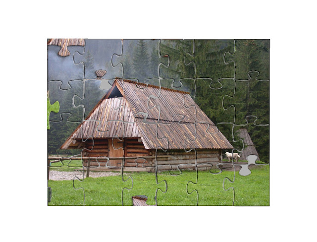
I just completed the last of a two part assignment for my class.  It's kind of cool, so I thought I'd share.

The original picture


The first assignment was to cut and paste using the selection tools we learned about in class to assemble the puzzle. 
The second part of the assignment was to use patch, clone, and heal to get rid of the lines and recreate the full photo of the cabin.
Pretty neat, huh?  I can still see a few places that could be blended a little better, but to the untrained eye its pretty amazing what you can do with this program.

Thursday, February 3, 2011

Helping a friend with my new skills

Our best couple friends are getting married in October.  The bride's mother lives in another state and the only  other bridesmaid that lives locally is in nursing school full time, working, and currently very pregnant.  So I have have got to play surrogate everything and actively help out with lots of the planning.  It's so much more fun doing that stuff when you're not paying for it!

I had already agreed to taking engagement photos for her to help her save some cash and give me valuable experience and hopefully portfolio material.  So when she was having a difficult time finding invitations which were affordable that she also liked, I thought my newly growing photoshop skills might come in handy.

One night while laying in bed unable to sleep, I played around with some papers and frames I already had saved on my laptop.  I came up with this:

A photo of them would go in the frame on one side of the invitation, and then the verbiage would be on the other.

Then, as I was browsing different printers online, trying to see about how much it would cost to print the amount she needed and if doing them custom would actually be saving her any money, I came across these Die cut cards

Eureka!  These are awesome!  I remembered seeing some Christmas cards made in this format through the holidays, but at the time I didn't know enough about photoshop to lay out a card template on my own.  I had mine printed on a site that offered free pre-made templates.  But these would make beautiful invites.  

So I had her send me some links to a few invites she really liked (but were out of her price range) and came up with this:


Which she liked.  But were were talking about some other things I had saved on my computer and I showed her my first version (the one I threw together with stuff I had on hand).  She really liked the worn damask background, but the colors were a little off and we definitely wanted to use the die cut template.

After looking for free damask textures or papers online, and not finding anything completely suitable, I layered together a paper and a pattern, then ran some vintage actions on it and added noise to get a damask that had the look and colors she wanted.

Voila!


I was thrilled with it.  She was very happy with it and actually said she liked it better than anything else she had seen.  I'm still going to tweak it a bit by letting her browse some free fonts online, decide the exact verbiage for the invite side, then possibly add a cute/romantic quote for the photo side.  And obviously, a photo once we get them taken.  But, I am really pleased with them already.  I think I might be doing more of these in the future.